As I walked through the front door of the small Nave Museum in Victoria, Texas, I was immediately struck by the vivid colors and the symmetry of the space. The Natural Artistry of Madeline O’Connor took up the entirety of the small museum, which was all of two large rooms. The Exhibition was on display from September 26th- November 3rd, 2019 and it showed the great detail to design Madeline O’Connor displayed in her artworks.
The exhibit showcased thirteen of O’Connor’s original works, acquired by the museum from her estate as well as private collectors. For most of my visit in The Nave, I was the only person there besides the museum employee and she gave my quite a bit of information about the way these artworks were acquired and installed, as well as a little more information about O’Connor. I thought her name sounded familiar, and the reason is because we have a plaza in downtown Victoria named the O’Connor Plaza. It is the tallest building in the county and it was owned by the O’Connor family, Madeline O’Connor’s family.
The museum employee also told me that O’Connor, when she was living, lived only a few blocks away from the museum, in the heart of the historic Downtown Victoria. She had a workshop just in the back of her house and it has not been touched since her death, leaving things just as she left them. However, Victoria got hit by Hurricane Harvey in 2017 and left the workshop riddled with water damage and mold, making it toxic for anyone to go in there for an extended period of time. There is an effort being made to restore the workshop and potentially save the works of art that are still in there.
Because of the small size of the museum, I as the spectator, felt a personal and intimate essence being surrounded by O’Connor’s work. The first room showcased two large artworks that were very similar in design on the right and left walls. On the right wall, the artwork Ibis Series, 1987 was displayed. It is a series of canvases overlapping one another. On the far left side of each canvas, there are varying square and rectangular pieces cut of each canvas. The artwork, comprised of nineteen canvases in total and spanning 216 inches in length, features shades reds, blues, greys, blacks, greens, and browns and stretches across in a monochromatic scheme. The canvases were also painted in a way that produced a metallic-like sheen to the canvas, really bringing the color to life against the white gallery walls and beneath the bright white light. An Ibis, to me sounded like a type of bird. I did some research about it because I wanted to make sure I understood the name of the painting. My research yielded the information that concluded that my guess was correct, but it also yielded images of an Ibis and those images showed me that the colors used in O’Connor’s Ibis Series were an accurate representation of the colors present in the species of bird.
This discovery was an interesting anecdote to something else the museum employee had told me. In some of O’Connor’s other works, Cruz Peligroso, 1993, Dominant Red-Wing, 1993, and Penshells, 1993, the artist uses metal, cross-shaped shadow boxes to display feathers, twigs, leaves, and other things found in nature. The museum employee told me that O’Connor loved to be in nature, going on walks, and studying the things around her. The items in the shadow boxes had all been things she personally gathered in nature and it really brought the color scheme of Ibis Series full circle for me. Knowing that she was one with nature and knowing that had to have some impact on her work provided meaning for me, as the spectator. This meaning was that inspiration can strike anywhere, but it is especially likely when surround yourself with things you love. For O’Connor, that was nature.
Continuing through the exhibit, on the opposite wall of Ibis Series, was another very similar series of twenty canvases titled Purple Gallinule Series, 1985. The canvases are all overlapping and have similar square and rectangular shapes coming out of the sides, but they are cut out of the opposite side of the Ibis Series. The vibrant, metallic colors in this artwork contain hues of reds, oranges, pinks, golds, blacks, and browns. These colors are also found in a species of bird, the purple gallinule, in which the series was named after. The careful consideration of the colors to match those found in the feathers of the birds evoked a feeling of the artist being connected with nature. It is also worth noting that in both of these artworks, the shape that the overlapping canvases make is a rectangle. I rectangle has a strong, solid base and this adds to the feeling of stability in both of these series.
Before the spectator reaches the hallway, on the small areas of wall space framing the doorway into the second gallery, the small space of wall is occupied by three cross-shaped shadow boxes. These shadow boxes, as I said above, contain feathers, twigs, leaves, and other natural elements found in nature. The dimensions of all three cross-shaped shadow boxes are about 40” x 40”. They are not identical which allows the spectator to confer that they were made by hand, not factory manufactured. The implications of this flow tie into the organic elements of the exhibit. The name of the first shadow box, Cruz Peligroso, translates from Spanish as ‘dangerous cross’. This allowed for me, as a spectator with decent background in the Spanish language to know that O’Connor did not intend for this shape to be a plus, but rather a cross. The implications of this is that O’Connor was familiar with a faith that had a cross as a main symbol, like Catholicism or Christianity.
Crossing into the next room of the exhibition, the room is much wider than the first room, and again, provides a symmetry. There is one artwork each on the walls to the left and right and they are titled Cross/Plus, 1998 and Minus/Negative, 1998. Starting with Cross/Plus, the artwork features fifteen nearly identical cross figures, five crosses each in three rows. They are made from canvas and the entirety of the piece measures 66 ⅛” x 114” x 3”. The only color present in this work is black and I think it was a solid choice given the simplicity of the work. On the opposing wall, the work Minus/Negative is featured measuring 54 1/14” x 114” x 3”. Likewise, the minus signs are made of canvas and the only color present in black. Having these two artworks present in the same exhibit on opposite walls proves to be an interesting dichotomy. The spectator is forced to think the implications caused by feature of the negatives and positives. In relation to the natural vibe O’Connor exhibits in the previous room, it made me think of life. Life has ups and downs, positives and negatives. It rarely stays the same for long, and it is just as simple as that. I think with the simplicity of these pieces, that is the feeling O’Connor was trying to evoke. I believe she was making it, bold, clear, and to the point: you have to take the good with the bad because you are not going to escape either one.
In the pamphlet about the exhibit, it features all of the artworks and how the museum obtained them. Many were from private collectors and the rest were from Madeline O’Connor’s estate. The Cross/Plus and Minus/Negative were both courtesy of O’Connor’s estate, which did make me wonder if she displayed it in her home, possibly as a reminder of the realities of life, of the positive and negative times.
A few other works featured on a small wall in the second room of the exhibit, featuring works from O’Connors realism stage in her artwork. The other works I have described have been works of minimalism and naturalism, but it was interesting to me that these three works were on a small piece of wall, almost tucked into a corner. One of the works was a portrait titled Mr. Francis, 1968. It is oil on canvas and framed in large frame with gold accents. The dimensions of this artwork are 39” x 51”. It depicts an older man on a dark background. The gentleman is wearing a button down shirt and blue jean overalls and he’s grasping a twig in his hands. The museum employee told me that the O’Connor family grappled with the decision to even include O’Connor’s works of realism because O’Connor did not care for them. The family ultimately decided to include these works of art in the exhibit because the man portrayed in the portrait, Mr. Francis, was a close family friend and they thought even though he had passed away long ago, that is was a good way to honor him. I personally think it was the right move to include the works of realism in the exhibit because it gives a more well-rounded view of who Madeline O’Connor was as an artist, it showed her various capabilities, but it also showed the way she excelled in the realms she liked best, naturalism and minimalism.
The exhibit offered a unique and intimate view at the works Madeline O’Connor created in her life as an artist. It was also a great way to honor an artist that lived in Victoria her entire life. I liked the small, cozy feelings the small museum evoked for the spectators. My biggest critique would be the walkway between the two galleries. It is a hallway that doubles as an office space and it was very cluttered, taking away from the viewer’s experience to be completely immersed by Madeline O’Connor’s artwork.
One of the reasons I chose this exhibit is because when I was given the assignment for the formal analysis, not only did I know I was going to be going to my hometown that weekend, Victoria, Texas, but I also thought it would be important and insightful to see work from an artist who was born, raised, and passed away in the place I called home for my first eighteen years of life. The experience I obtained was more powerful than I could have imagined. When I left the cozy, intimate gallery space called the Nave Museum, I felt more connected with my hometown. Seeing artworks inspired by nature present in my hometown helped provide meaning to O’Connor’s work and meaning to the way I view where I grew up. Victoria, Texas is growing rapidly now with the presence of oilfield jobs, but growing up, the town had a population of just over 60,000 people and it felt even smaller than that. When I left for college in 2015, I was so excited to leave and didn’t think I would ever want to go back. In the last couple of years, however, my grandparents have had their share of illnesses and my grandfather was diagnosed with a rapidly progressing case of Alzheimer’s. In the course of less than two years, one of my favorite places to go in Victoria, my grandparents house, has become a place that is extremely difficult for me to go to. When I am there and feeling overwhelmed, one thing I can do to help ease my mind is to go for a drive and I often end of driving through riverside park, a park shaded in big oak trees that cover the Guadalupe River. When I am there, I am one with nature. I feel a calmness, a stillness, knowing that I have to trust the natural process of things, and then I am ready to face the hard things. I am not sure if that was the intention of the exhibition of Madeline O’Connors work, but for me, it solidified the bond I have been making with the nature in my hometown and it highlighted the beauty of the nature all around me.
(2,024 words)
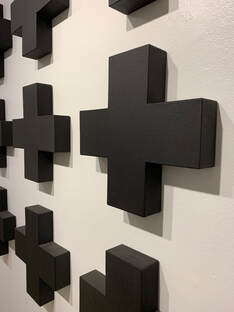
To the left, a close up of O'Connor's Cross/Plus
