Ten nights to get your fill of lights and social media posts. The Waller Creek show is now on their 6th annual year using local artists to create bright and colorful installations along the creek. The artists involved in this show are Norma + Sunny, Design workshop, 1909B, Boka Powell, Frankev and Nelson Partners. This is the first year I attend and from what I noticed the crowds were big and anxious to start taking pictures. Not only was this the perfect place to take a snap but it was filled with a multi-sensory moments. Life in Austin is full of new events this is a sponsored event for the arts which I think is pretty great. Especially when it’s free and available to the public! Community is something I think is important to the arts. In Austin we have events for families and individuals all the time but having something geared for our local art community gives me hope that people really see the importance of art in their lives. This art show brought about people from all ages having fun and using these artist instillations as backdrops for their photo ops.
The start of the show I walked by a house built of string lights. The colors are vibrant and luminate the darkness around. The artists Norma + Sunny used neon colors throughout the installation as well as some deeper colors. However, from what I noticed this was not the place to stop and take pictures. Very few people stopped to pose in front of the house with the awesome neon lights, but most just breezed on by it. I was surprised to see that the gate to the entrance of the house was closed. I think it definitely would have sparked more interest if people were allowed to walk through the house and experience the colors in a closer and intimate way. It has such an interactive factor that no one was able to be part of. I could understand why so many people decided to just keep walking.
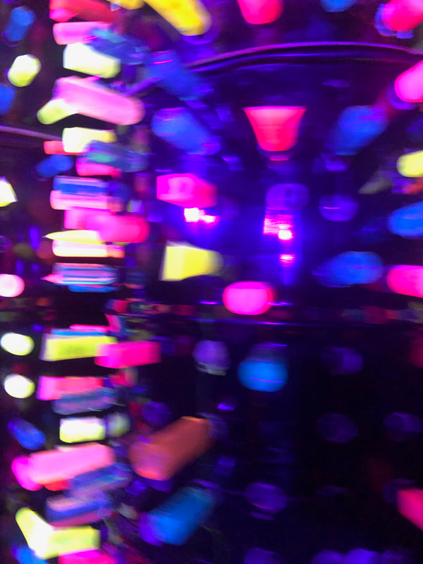
As I walked along the creek, I enjoyed taking in the scenery in between each artists artwork. I felt this particular instillation is impactful, Downstream Upcycle by Design Workshop. I think about our impact on our environment on a daily basis. I try to be conscious on my own waste and use of materials. Here I was in front of 17,000 hotel shampoo bottles and they were a lit up into magnificent neon colors all lined up perfectly to be admired. I wish I had time to count every single bottle to see if it was truly 17,00 but there were so many it made my eyes dizzy just trying. I felt as if the amount of plastic used in one hotel was highlighted for all of us to see. Did everyone realize this? or was everyone simply enthralled with the colors surrounding them demanding them to pose with the bottles as a background. The Design Workshop took these tiny plastic bottles repurposed them and lit them up! It was fun but also had an underlying message. The struggle of standard practices and use of materials in world. I do hope most people reflected on this message; along with taking their selfies with the vibrant backdrops.
.
Walking away from the neon colors and the crowd it becomes pitch dark until I turn a corner and the lights are murmuring like crazy. Flashing in rapid instances showing the motion of the water running under them. The artwork is called Aurora designed and put together by 1909B this group of artists used space, light, and sound to emphasize the nature surrounding the work of art. People were all over the place! The space the area provided was wide and long. Each rod of light was perfectly spaced out. The light used was great the way it reflected off the water tricking my eyes in to thinking the water was going faster than it really was. At this point everyone started playing along the lights jumping up creating movements to be captured. The music being used synched perfectly to the shuttering of the lights. I felt there was so much going on it seemed it would be overwhelming, but it actually kept drawing me in. Other than the captivating lights and sounds I couldn’t really think of an impact this work of art would evoke. It was fun and I enjoyed it there was just nothing else to reflect on.
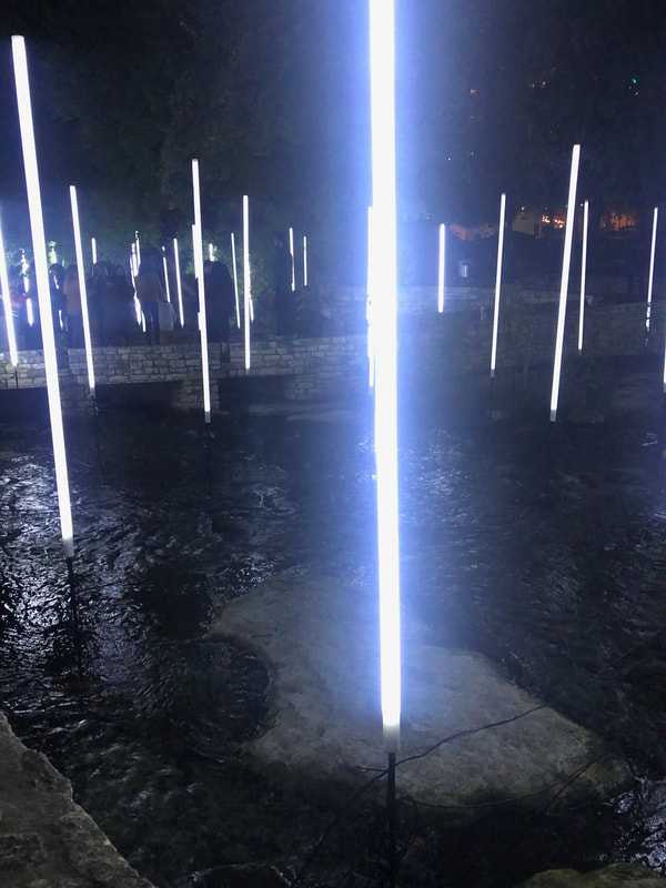
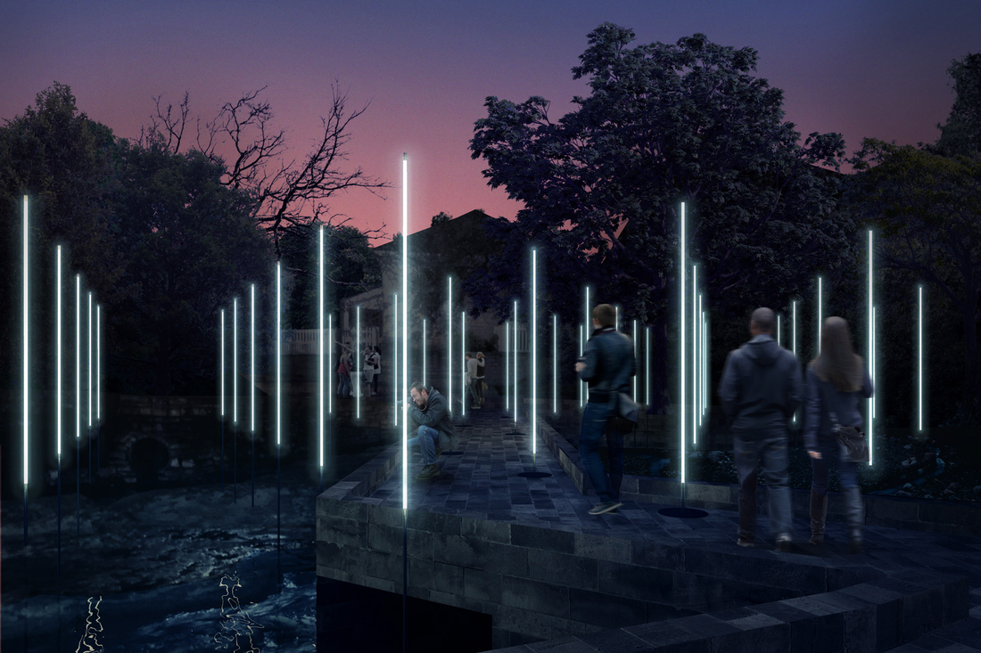
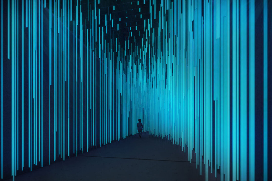
As I continue my way the next light instillation was String theory by Boka Powell, although the artist used similar colors as the other instillations these lights, were crisp composed and seemed more rigid. What caught my eye was how the straight laser lines reflected against the water. Although the ripples made of mess of the lines and didn’t match the rigidity of the lines above it. The look still provided a satisfying feel that transferred to the water effortlessly. Again, I think this work of art was meant to be aesthetically pleasing. The lights were repetitive, and it didn’t trigger any kind of emotion or memory.
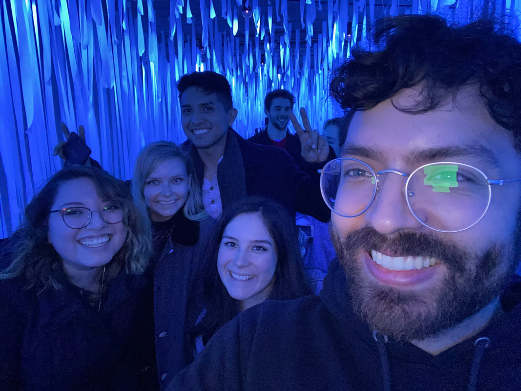
In another cave like structure Frankev uses strips of what I assume is white fabric and hung them from the ceiling of the cave. The effect of the black light made this cave light up bright blue. The pieces of fabric just graze each body walking through. It was a whimsical experience everyone in the crowd stopped to take pictures it was almost a requirement to capture this blue light that also lit up any white that was on the person including teeth! I couldn’t help thinking about how much it reminded me of toilet paper being used to teepee a house. Maybe that’s why it felt so freeing and fun almost like a small act of vandalism that everyone can see. I also wondered if the artist did this on purpose. Purposely setting up strips of fabric of all sizes to be draped along the ceiling. I could see it resembling a used area that has now been abandoned.
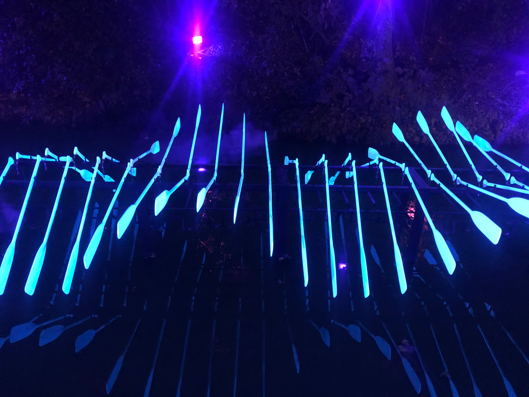
Finally, I end the walk and exhibition with The Ghost Boat, by Nelsen Partners. This portion of the exhibit used both visual and audio affects. here are two rows of oars lined up horizontally and, in the background, you have these sounds of water swishing as if the oars were actually touching the water. The oars in this instillation appear to float above the water. The glowing effect of the oars made me think of a ribcage. The sound of the water and the movement of the oars made it look as if the ribcage was filling with air. The title Ghost Boat is fitting it’s empty and hallow but yet has physical form that allows the mind to associate movement. In this case it’s not going anywhere but the manner it’s suspended the oars move in place. Giving a sense that this boat could fly away at any point in time. Nelson Partners definitely did not fulfill the theme of the night if there was one; I felt it had to do with color. Ghost Boat doesn’t use the colorful palette the others have but still gives off a great glow.
Closing out the exhibition in this manner was a bit odd. All of the previous art instillations had whimsy, color, and fun aspects while Ghost Boat offered more of a somber and isolated approach. I did feel like each work of art could work individually. At times I felt like they were too similar but then others like the Ghost Boat were on their own meaning and feeling wise. Overall it was a cool way to spend the night. I hope the creek show continues to grow. I do believe it’s a great way for our local artist to feel part of the community, and for those in the community to be involved with the arts. The importance of art in our culture is not always emphasized so I am happy to see that this event allows people to come together and enjoy an array of art instillations. Waller creek has a website to continue to grow the interest of the conservatory and to help the people of Austin to be out in nature. To enjoy different events such as this one. I realized this event had over 60,000 viewers this year. The following is growing and one aspect that I read was important to make this happen are the local businesses who sponsor and provide their time and funds to make events like this happen. Which is great the support not only for local artists but our local businesses.
The start of the show I walked by a house built of string lights. The colors are vibrant and luminate the darkness around. The artists Norma + Sunny used neon colors throughout the installation as well as some deeper colors. However, from what I noticed this was not the place to stop and take pictures. Very few people stopped to pose in front of the house with the awesome neon lights, but most just breezed on by it. I was surprised to see that the gate to the entrance of the house was closed. I think it definitely would have sparked more interest if people were allowed to walk through the house and experience the colors in a closer and intimate way. It has such an interactive factor that no one was able to be part of. I could understand why so many people decided to just keep walking.
As I walked along the creek, I enjoyed taking in the scenery in between each artists artwork. I felt this particular instillation is impactful, Downstream Upcycle by Design Workshop. I think about our impact on our environment on a daily basis. I try to be conscious on my own waste and use of materials. Here I was in front of 17,000 hotel shampoo bottles and they were a lit up into magnificent neon colors all lined up perfectly to be admired. I wish I had time to count every single bottle to see if it was truly 17,00 but there were so many it made my eyes dizzy just trying. I felt as if the amount of plastic used in one hotel was highlighted for all of us to see. Did everyone realize this? or was everyone simply enthralled with the colors surrounding them demanding them to pose with the bottles as a background. The Design Workshop took these tiny plastic bottles repurposed them and lit them up! It was fun but also had an underlying message. The struggle of standard practices and use of materials in world. I do hope most people reflected on this message; along with taking their selfies with the vibrant backdrops.
.
Walking away from the neon colors and the crowd it becomes pitch dark until I turn a corner and the lights are murmuring like crazy. Flashing in rapid instances showing the motion of the water running under them. The artwork is called Aurora designed and put together by 1909B this group of artists used space, light, and sound to emphasize the nature surrounding the work of art. People were all over the place! The space the area provided was wide and long. Each rod of light was perfectly spaced out. The light used was great the way it reflected off the water tricking my eyes in to thinking the water was going faster than it really was. At this point everyone started playing along the lights jumping up creating movements to be captured. The music being used synched perfectly to the shuttering of the lights. I felt there was so much going on it seemed it would be overwhelming, but it actually kept drawing me in. Other than the captivating lights and sounds I couldn’t really think of an impact this work of art would evoke. It was fun and I enjoyed it there was just nothing else to reflect on.
As I continue my way the next light instillation was String theory by Boka Powell, although the artist used similar colors as the other instillations these lights, were crisp composed and seemed more rigid. What caught my eye was how the straight laser lines reflected against the water. Although the ripples made of mess of the lines and didn’t match the rigidity of the lines above it. The look still provided a satisfying feel that transferred to the water effortlessly. Again, I think this work of art was meant to be aesthetically pleasing. The lights were repetitive, and it didn’t trigger any kind of emotion or memory.
In another cave like structure Frankev uses strips of what I assume is white fabric and hung them from the ceiling of the cave. The effect of the black light made this cave light up bright blue. The pieces of fabric just graze each body walking through. It was a whimsical experience everyone in the crowd stopped to take pictures it was almost a requirement to capture this blue light that also lit up any white that was on the person including teeth! I couldn’t help thinking about how much it reminded me of toilet paper being used to teepee a house. Maybe that’s why it felt so freeing and fun almost like a small act of vandalism that everyone can see. I also wondered if the artist did this on purpose. Purposely setting up strips of fabric of all sizes to be draped along the ceiling. I could see it resembling a used area that has now been abandoned.
Finally, I end the walk and exhibition with The Ghost Boat, by Nelsen Partners. This portion of the exhibit used both visual and audio affects. here are two rows of oars lined up horizontally and, in the background, you have these sounds of water swishing as if the oars were actually touching the water. The oars in this instillation appear to float above the water. The glowing effect of the oars made me think of a ribcage. The sound of the water and the movement of the oars made it look as if the ribcage was filling with air. The title Ghost Boat is fitting it’s empty and hallow but yet has physical form that allows the mind to associate movement. In this case it’s not going anywhere but the manner it’s suspended the oars move in place. Giving a sense that this boat could fly away at any point in time. Nelson Partners definitely did not fulfill the theme of the night if there was one; I felt it had to do with color. Ghost Boat doesn’t use the colorful palette the others have but still gives off a great glow.
Closing out the exhibition in this manner was a bit odd. All of the previous art instillations had whimsy, color, and fun aspects while Ghost Boat offered more of a somber and isolated approach. I did feel like each work of art could work individually. At times I felt like they were too similar but then others like the Ghost Boat were on their own meaning and feeling wise. Overall it was a cool way to spend the night. I hope the creek show continues to grow. I do believe it’s a great way for our local artist to feel part of the community, and for those in the community to be involved with the arts. The importance of art in our culture is not always emphasized so I am happy to see that this event allows people to come together and enjoy an array of art instillations. Waller creek has a website to continue to grow the interest of the conservatory and to help the people of Austin to be out in nature. To enjoy different events such as this one. I realized this event had over 60,000 viewers this year. The following is growing and one aspect that I read was important to make this happen are the local businesses who sponsor and provide their time and funds to make events like this happen. Which is great the support not only for local artists but our local businesses.
| img_4202.mov |
